Core Matter
Brand Strategy, Digital
Neo-retro brand system for a nonprofit fighting food waste.

The challenge
Core Matter is a Bay Area-based nonprofit that drives behavior change around food waste with innovative communications. With primary audiences of nonprofit partners, policymakers, and the general public, the brand had to be inspiring as well as convey rigor and respectability. The brand system needed to break from the mold of blue and green, but still clearly convey environmental values.
The solution
Drawing inspiration from the 1960s counterculture magazine Whole Earth Catalog, the look and feel is simultaneously a nod to the history of the environmental movement and looking to the future. Collaged illustrations, vivid color, and familiar imagery combine to create a brand that feels both reputable and exciting.
A seed of inspiration
At the center of the logo is an apple seed. In apples, the seed is stored in the core—the part of the apple that’s often thrown in the trash. The brand celebrates the great potential in the resources our society often discards.
Engaging infographics for social media
Medium articles are a primary way that Core Matter shares their research. We created a collage illustration system that allows us to use familiar objects to break down and share complex stories—about our food system, policy, human behavior—in a playful, intriguing way. The infographic system allows viewers to understand data in bite sized bits.
A brand that can flex for spinoff projects
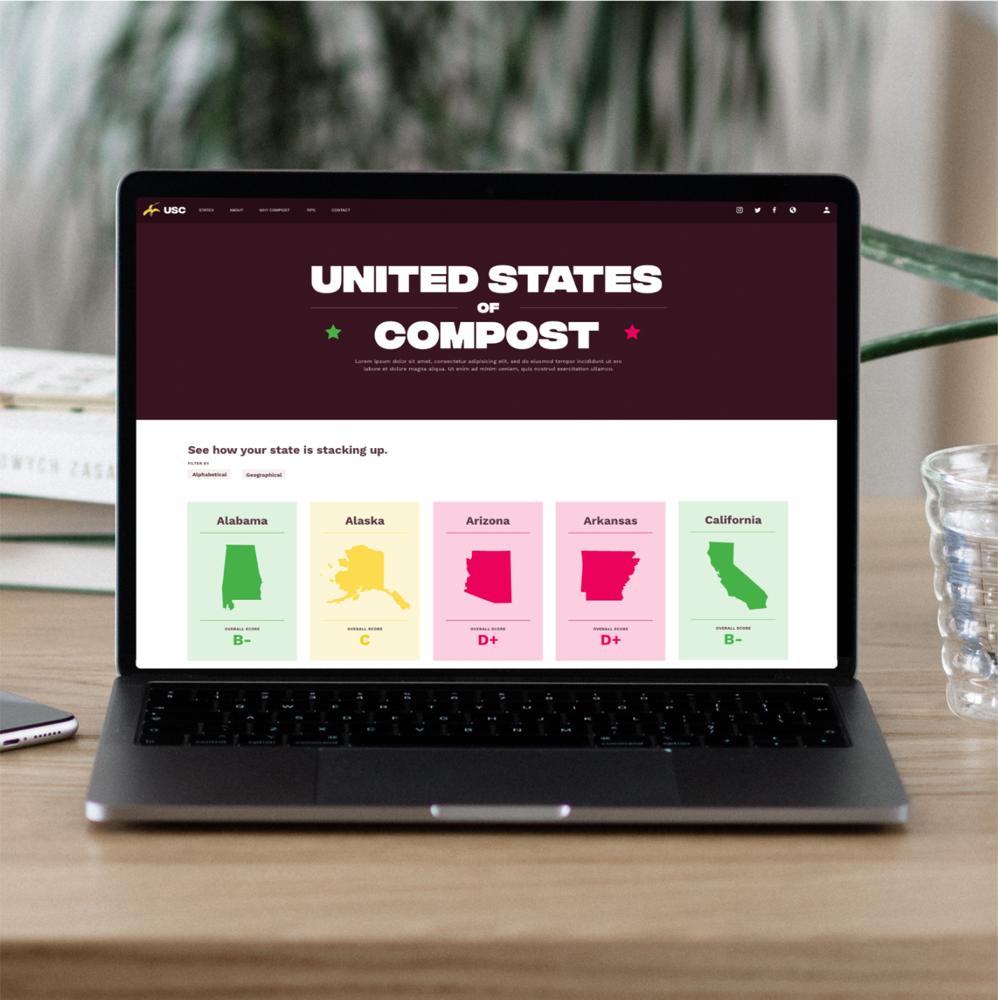
Core Matter creates many spinoff projects. Using the main brand as a foundation, Core Matter is able to create spinoff projects are visually distinct while still drawing back to the core company.


