Mission Bit
Brand Identity, Digital
A fun, bold new brand that embraces diversity
My role
Lead Designer
In collaboration with
Sans Serif
The challenge
Mission Bit is a non-profit 501(c)(3) based in San Francisco that offers free computer science classes to youth of color in the Bay Area. We partnered with them for a pro-bono rebrand and web redesign—with the goal of growing their student base, establishing fuller trust with adult allies, and communicating credibility to key existing and future donors.
The solution
The chosen concept, called “Embracing Diversity,” celebrates place, inclusion, and difference, along with the unique fun and vibrancy that differentiate the organization and its team.
A brand concept that embraces diversity
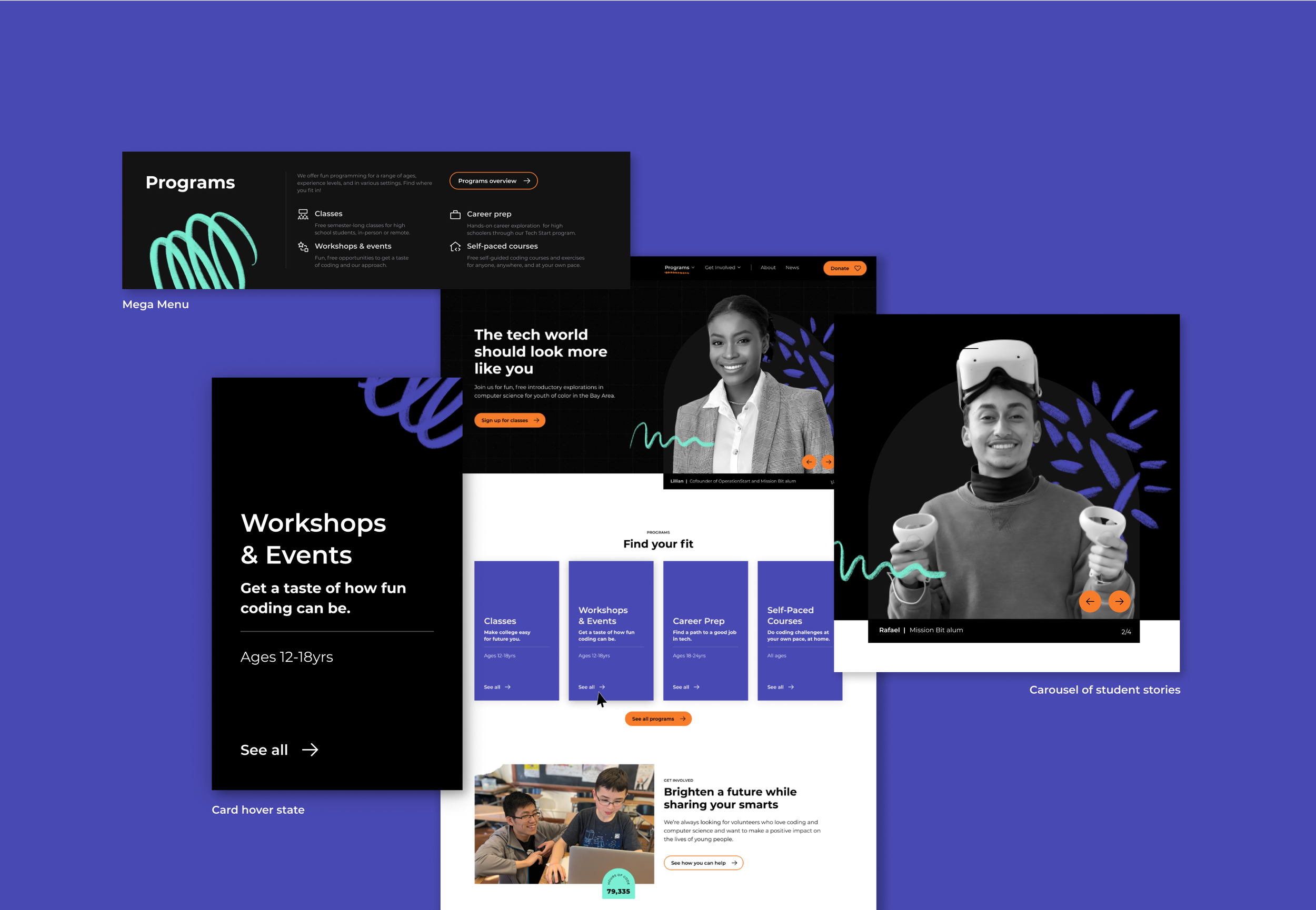
The new brand had to appeal to students who may not see themselves in tech—and may not see coding as particularly fun or cool. The nested shapes of the black-and-white logo show that whoever you are, you belong at Mission Bit, and in tech. We also created vibrant, custom hand-drawn graphics. By collaging visual elements together, we express the beauty of Mission Bit's diversity, community, grassroots past, and hands-on approach to empowering youth of color.
A vibrant, easy-to-navigate website
Using our brand strategy and look and feel as a guide, we helped bring to life the brand personality of Mission Bit through a completely revamped website. As we considered the user journeys for students, adult allies, and donors, we brought in new features like class filtering and mega menus to give users a high level look at content to help them make decisions. In the visual design system, we established orange primarily for buttons/interactive components, and used collaged elements and bold typography sparingly for key content.


